Projects
Modura
The Ask:
Rebrand a brick and mortar company for an appealing online store
Design a mobile site to appeal to young, trendy, and urban professionals
Limitations: One week turnaround and limited budget
What I Would Have Done Differently:
The branding and site was based on assumptions and design patterns that we know works.
If time and budget permitted it, I would have liked to have set up some time for UX Research to find out what appeals to the target demographic and test out newer and different functions that may make a more appealing shop.
The Process:
Brainstormed through word cloud and sketched a few different logo ideas based on items necessary for professional careers like a briefcase.
Ultimately, the heartbeat logo was selected and digitized because of the excitement of starting a new career.
After the logo was selected, I created a style tile containing the logo, color palette, typography, photo treatment and style, and icons to reflect Modura’s brand keywords.
For the mobile site, I created:
Simple Sign Up screen containing only the vistor’s username and password to capture as many possible
Homescreen with images and a dark yellow treatment with a the stenciled text overlay for a young urban look
Product Detail screen utilizing bespoke icons and a favorited icon to encourage shoppers to come back to items that they like at later time


Wayfarer
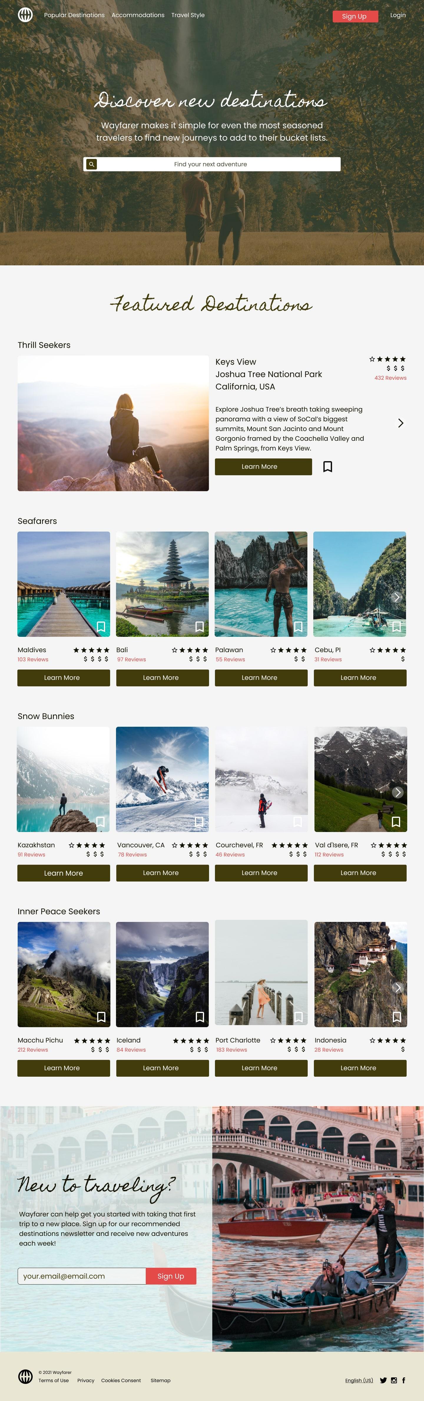
The Ask: Design a desktop and mobile homepage that users will see when they first find Wayfarer, a vacation research platform geared towards young adults from ages 21-30, that helps travelers discover new international destinations to visit. It needed to show featured destinations, explain briefly what Wayfarer is, and include a call-to-action to sign up for the newsletter.
The Limitations: The design needed to be completed within 10 hours
What I Would Have Done Differently:
I would have liked to add a few more vacation categorizations for user for both desktop and mobile
For mobile, I wanted to show that if one location images is clicked, the section would expand with a tiny blurb with more details regarding each location. In the product detail screen, I should’ve included name, age, and the number of stars each reviewer gave.
The Process:
For the first portion of this project, I sketched a home page for desktop that aims to showcase Wayfarer’s vacation research capabilities and assist new travelers with their first trip through their newsletter.
Starting from a mind map brainstorm, I concluded that I wanted provide different types of vacations/adventures for the young traveler based on their travel preferences. Whether the traveler likes cold weather adventures or beach escapades, if they like to travel solo or in a group, if they want to relax or learn more about a country’s culture, I want the user to feel like the Wayfarer app has research for almost everyone’s travel taste.
For the brand colors, I used forest green with accents of coral. I based the color palette from the hero image. Green represents nature, growth, freshness, and balance. Wayfarer is fresh and new and travel provides opportunities for growth. Wayfarer seeks to encourage that. I chose accents of coral to help CTA’s pop from the green, since it is green’s complementary color, but not as in your face as regular red.
For the type, I’ve paired a handwritten script font as the main header because it’s more approachable and attainable for young new travelers, with a sans serif font to juxtapose the script and add a little for gravitas to the site.
The homepage includes an immediate image in the background as a hero to pique the user’s interest. The navigation is located on the upper left-hand corner near the logo that will be sticky as you scroll down the page in for easy access. The newsletter sign-up button is reddish on the upper right near the login to attract the user’s attention, of which only the login will be sticky with the rest of the nav. I didn’t want the user to ignore the sign-up with its constant presence. Additionally, the search bar is the most prominent aspect of the page, so the user can search any destination they want with ease. Beneath it are the Featured Destinations, all of which are carousels. It was important to highlight a destination, to give the user a taste of what the platform will provide them. click on one of the location images, it will expand with a tiny blurb about it and a bit more detail on that specific location in the image, see “Thrill Seekers” as an example.
All destination cards contain a rating based on user reviews, the average cost of a vacation there, the number of user reviews, a save functionality, and a learn more CTA (which would lead to the destination detail page).
Each category is based on the user’s preferred vacation activity, whether it’s thrill seeking or relaxing in cold or warm beachy areas. I wanted to add another category for party goers, but had to omit it because of time constraints. Filtering the different types of vacations will help the user narrow down and select a destination to visit. Lastly, is the newsletter sign-up section. I used another image for the background, but chose to add a filter on top of half of the image to call attention to the text. I selected a photo of an older man steering a younger couple in a boat to imply that Wayfarer’s newsletter can guide/steer a new traveler in the right direction. The colors of this section should help it pop out more because I used my accent colors for it.
For the mobile screens, I created destination, destination detail, sign-in, and iOS sign-in screens.
The destination screen is like the desktop homepage without the search bar, since the search icon is in the navigation at the bottom of the app. This screen is just to show all the destinations. The bottom nav contains a home, explore, saved, and account. I’ve also placed a red circle to indicate what tab we’re looking at.
The destination details screen contains the location of the destination at the top, a carousel of images with a page indicator, a more in-depth description of the locations, the reviews, and affordability. The difference is that there is a gallery carousel of activities. I wanted this function to expand once you click on the image to see all the possible activities provided by the site and reviewers but forwent it because of time constraints. In the next iteration, I’d love to expand this section to show what I had in mind. Beneath it, is a travel style segment, this is to indicate what kind of travel this place is best for- solo, couple, group, or family trips. This example’s icons indicates that Cebu is great for all types of travel. There’s a review section that contains the cards of the reviewers. . I’ve also included a map for the user to search activities and visualize where this location is in comparison to their current location. Lastly, are the places to stay section would link to Airbnb or whatever site the stay can be booked. Since the platform does not book stays, linking externally should make it even easier for the person to plan their trip.
Finally, are the sign-in screens. The first is super simple, it states what you’re signing up for. I wanted to connect Wayfarer to Apple, Facebook, and Gmail accounts to save the user time in creating their account, but also give them the option to use any email address and password. I also included an iOS sign-in screen where if you’ve saved your password on your iPhone via website you would instantly be brought to the facial recognition to sign-in.


Zeit
The Problem:
Time traveling is a new concept to the general public, how can we design responsive travel booking site that will entice users to book a vacation package with Zeit?
The Ask:
Research and identify target customers and key things we want to learn for Zeit, the first time-traveling booking site.
Synthesize key findings from user research and competitive analysis to create a persona for Zeit
Present Research Findings in a concise deck to key stakeholders
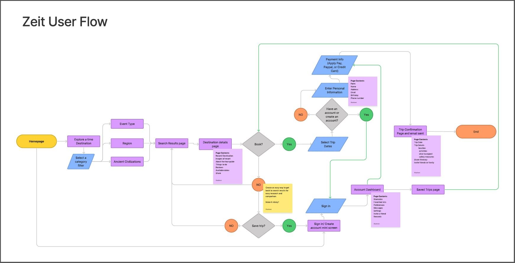
Utilize findings to mock up a user flow from homepage entry to package purchase
Sketch and digitize low-fi responsive homepage, product detail screen, and search result screen wireframes for desktop, tablet, and mobile screens
Create a Usability Test Plan, hi-fi desktop prototype through Figma to reflect the user flow mockup
Summarize, present, and iterate website design based on Usability test findings
The Limitations: Budget
What I Would Have Done Differently:
If time had permitted, I would have:
Designed a fleshed out FAQs page to help with product understanding
Added a few more obstacles during the checkout process to add some friction for a large purchase
Included more faux reviews because most users are skeptical of a new service and rely on reviews by people like them
The Process:
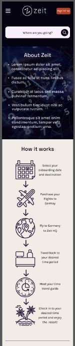
Two to three weeks were spent on research and branding. This included creating a research plan and designing a logo. The logo selected was the letter Z on a compass with arrows pointing from both ends of the Z to reflect traveling back to the past and traveling forward to the present.
The research methods utilized were user interviews and a competitive analysis. The user interviews consisted of five participants who prioritize vacations, between the ages of 31- 60. The competitive analysis did not include any direct competitors because Zeit provides new innovative services. The competitive analysis did focus on secondary competitors that provide immersive experiences like Expedia, Ticketmaster, and Oculus, as well as indirect competitors like museums and Disney World.
The goal of the competitive research and user interviews were to:
Identify a target demographic
Gauge demand for the service
Find out what Zeit needs to do to empower visitors to use their services
Through this research we found that people:
Will invest in immersive and novel experiences because they enjoy them
Are willing to invest ~$3k for their ideal vacation
Will endure tedious and annoying processes, if they think the experience is worth the effort
Need to familiarize themselves with the place ahead of time and have a traveling companion if they are traveling to a new destination
A few assumptions and risks going into the research were:
Time traveling has been tried and tested
We do not know how people will use time travel even if security measures are in place
Armed with these research insights, another week was spent defining who Zeit is, who their target demographic through a persona, what their business goals , user goals, and technical considerations are.
This is when Andrea, the persona was created. Andrea is a 32 year old teacher who is curious, outgoing, loves novel experiences, and courageous to delve into new situations if it’s “fun”. Her concerns are:
Safety: She likes having a travel companion and does extensive research on her travel destinations to familiarize herself with them
Budget: Is she getting the most bang for her buck? How much does she need to save for her next vacation?
Time: She has multiple tabs open on her desktop to compare destinations, flights, and hotels. She uses multiple apps to keep an eye on flights. She may settle on Expedia because the vacation planning process is stressful and she trusts them since she used them in the past.
Three to four weeks were spent designing the user flow, information architecture, wireframes, and prototypes incorporating the user research above.
One week was spent on testing with participants. For the usability tests our goal was to:
Learn about the ease of the checkout process from the entry point of the homepage to the purchase of a time traveling package.
Gauge user understanding of the product and services.
Identify any pain points or confusion while using the site via high fidelity prototype.
What we found out:
Users were able to navigate the website starting from the homepage to checkout.
The primary obstacle was content confusion. Clarifying what Zeit is above the fold on the homepage would help significantly.
The last week was dedicated on iterating the prototype’s design based on the usability testing results.
We iterated by making the following changes:
Added more information about Zeit next to the video on the homepage.
Added more details about what is included in the Zeit travel package on the checkout page.
Emphasized that flights were not included in the price.
Added photos of the resort.
Added more details to the product detail page instead of filler text.