

Zeit
The world’s first time-traveling vacation service, a fictional innovative company.
Background
Zeit, a subsidiary to Virgin, was founded by Richard Branson in Germany, which allows people to travel to the past.
Zeit offers trips with a total of 289 destinations world wide, from prehistoric to present times, with various desirable activities.
The Challenge
Business Challenge: How can Zeit encourage potential customers to purchase the first time-traveling vacation online?
Users’ Challenge: To purchase a vacation experience easily and confidently
The Objectives
Design a responsive e-commerce website that is easy to use and allows customers to browse through different categories relevant to them
Rebrand and design a logo for the company that is both modern and historical
My Role:
UX/ UI Designer
Timeframe
12 weeks
Tools
Figma, Miro, Optimal Workshop

Empathize
Research
The Research Goals:
In order to better understand and cater to future users, I set out to:
Determine the demand for the service
Identify the target audience
Learn user pain points when they book vacations online
The Research Methods:
User Interviews
Competitive Analysis
Research Synthesis:
Persona
Research Findings
Competitive Analysis
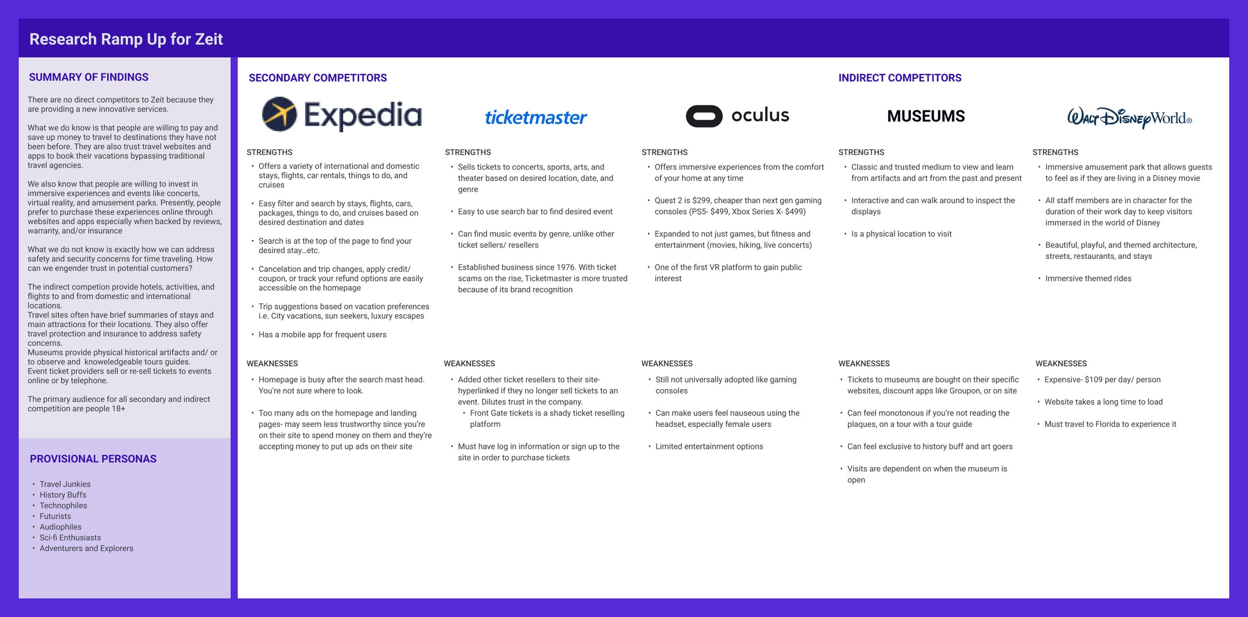

Secondary and Competitive Research Findings
People are willing to pay and save up money to travel to destinations that they have not been before
People are also trusting of travel websites to book their vacations, bypassing traditional agencies
They are willing to invest in immersive experiences like concerts, virtual reality, and amusement parks
People prefer to purchase these experiences online or through an app, especially when backed by reviews, warranty, and/or insurance
User Interviews
Ages: 30-62
Genders: 60% Female and 40% Male
Vacation Priority: 1-2 times a year

What we know now
100% of participants indicated that they need a companion to feel safe and/or share new experiences with
All were focused on getting the best deal for their vacations
100% of participants consulted multiple sources before booking their vacations
Overall, the participants expressed frustration with the vacation planning and booking process. Additionally, they expressed their concerns regarding safety.

The Research Findings
People enjoy novel and immersive experiences.
People are willing to invest ~$3k for their ideal vacation
People will endure tedious and annoying processes, if they think the experience is worth the effort.
Their main concern: they need to familiarize themselves with the place ahead of time and have a traveling companion with them
Define

Building the Persona
Utilizing the collective qualitative insights from the user interviews and the competitive analysis, I created the persona, Andrea that would further narrow down the specific goals and needs to help define the problems.

The Problems
How might we entice Andrea to purchase a time-traveling package that has no prior reviews?
How can we establish trust with Andrea to feel safe to purchase a time-traveling vacation?
What can we do to make the vacation planning process, as easy as possible?


Ideate
“If I’m planning a vacation in a place I’ve never been before, I’m definitely going to invite someone to come with me. ”

User Flow
Based on the Andrea Persona, the competitive analysis, and the user interviews, I documented a user flow to address Andrea’s concerns. It includes an intuitive way to share an itinerary, invite a friend, and a favorited list on their personal account dashboard.
Constructing the Sitemap
Culminating the ideate stage was the sitemap. This was initiated with a Card Sorting exercise, utilizing the Optimal Workshop platform, involving 10 participants based on the target users.
The sitemap below is extensive because of the filtering categories that the majority of the participants indicated they desired for the different events and time periods

Sketches- Homepage Options


Design

What we decided to design
Ultimately, I set out to design a website that is easy to navigate and book a time-traveling package.
Responsive Wireframes


The primary difference between desktop vs tablet and mobile is the About Zeit Video.
Since users are less likely to watch a video on their mobile devices on the go, I thought it would be better to have bite-sized bullet points to quickly understand what Zeit does, as a service.
All three screens were designed using 12 columns for desktop, 8 columns for tablet, and 4 for mobile.
The categories and menus on the main navigation on desktop were minimized to a hamburger menu. The search bar was shortened in both tablet and mobile to include the essentials when booking a package. They would then lead to additional screens to fill in the rest of the filters.
Branding
For Zeit’s branding, I wanted to convey futuristic, natural, minimal, yet familiar. The logo selected was the letter Z on a compass with arrows pointing from both ends of the Z to reflect traveling back to the past and traveling forward to the present. The Zeit style tile’s color palette reflect a space like and futuristic look and feel.


High-Fidelity Wireframing
For the designed screens, I wanted to show the user how they may navigate the website in order to book a time-traveling package. I used known design patterns in order to ease the learnability of the site, since it is a new and innovative service that has not been experienced before.
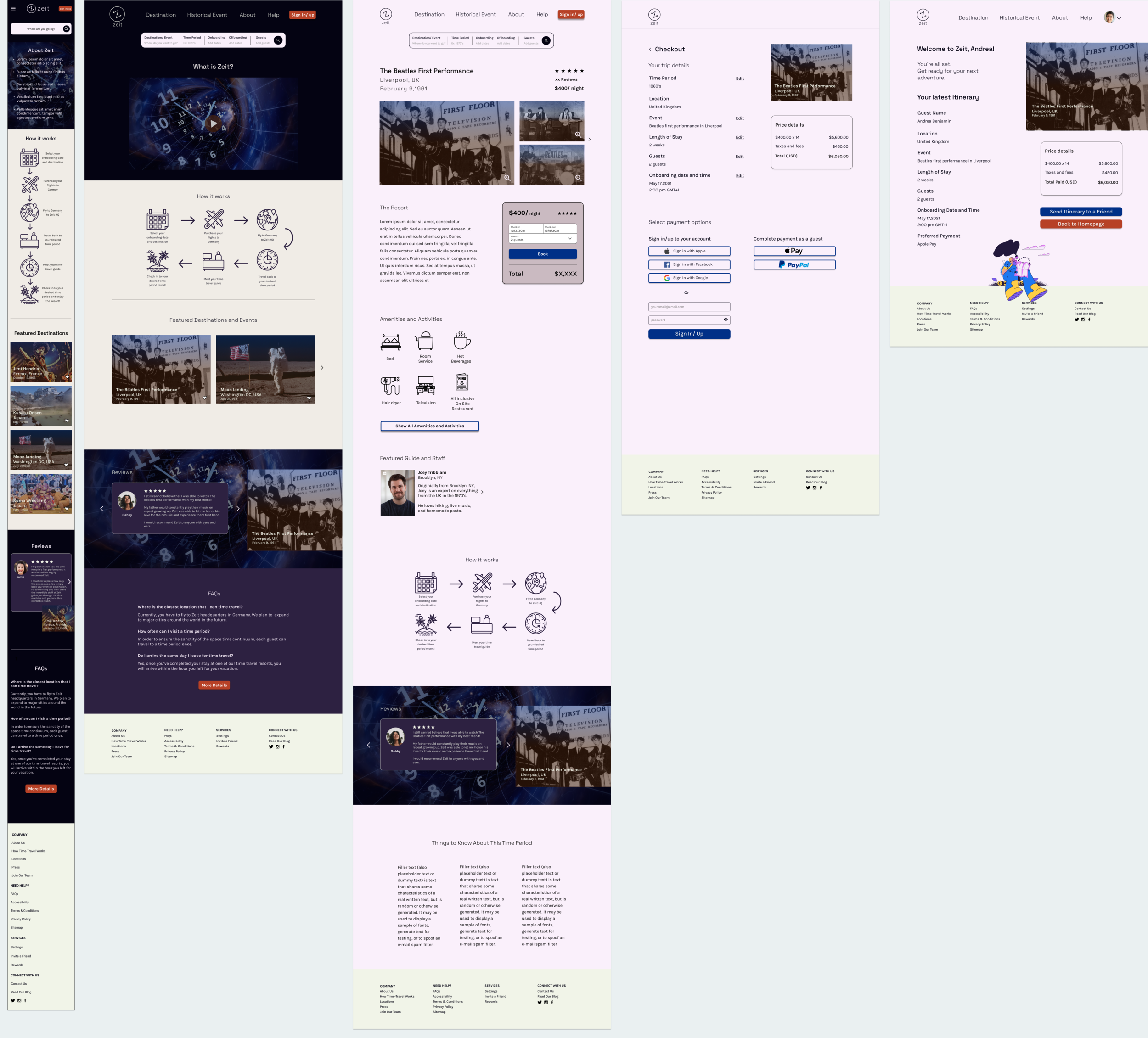

Creating the Prototype
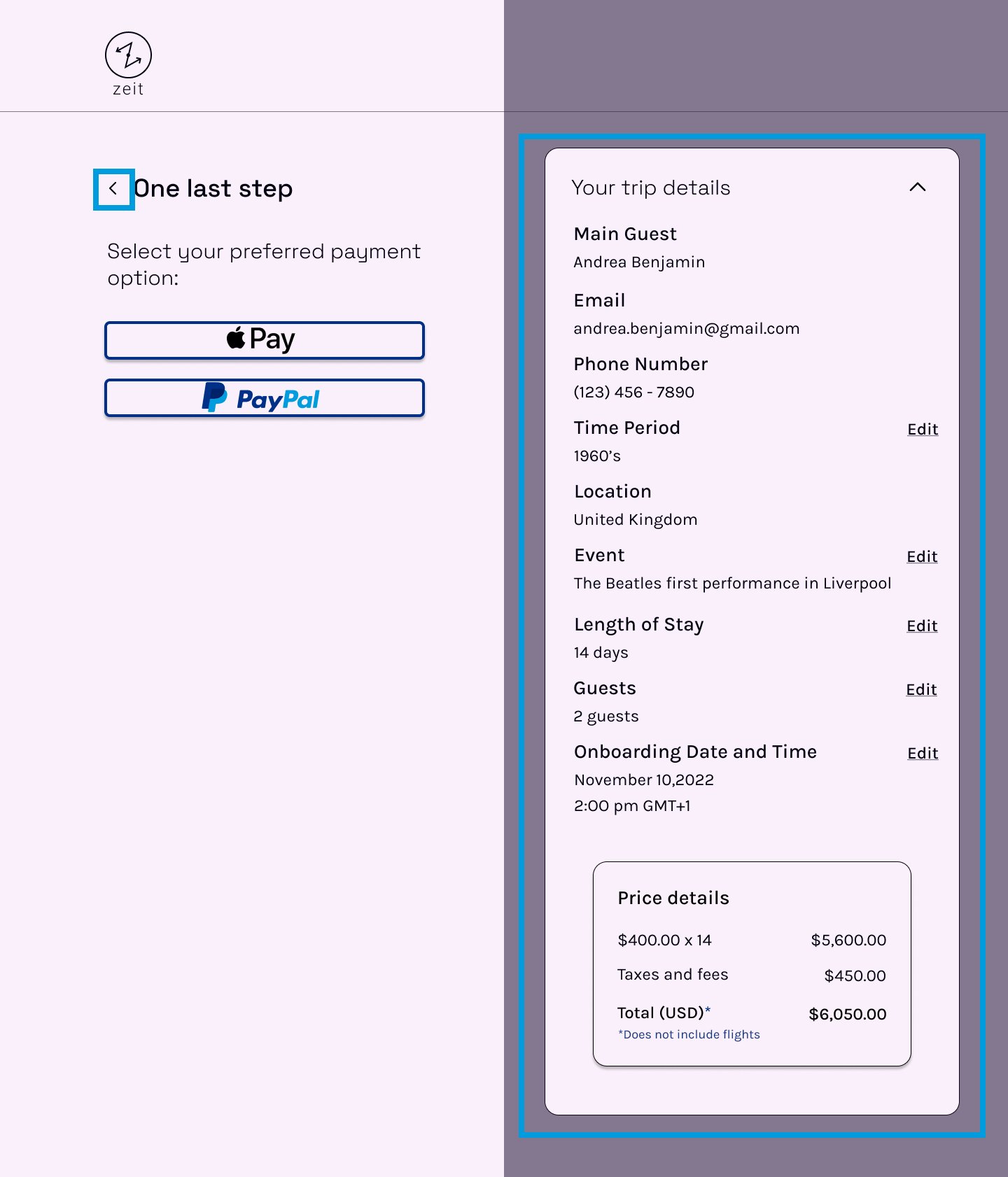
Once the branding and high fidelity pages were designed, using Figma, I created a prototype for testing. It was created based on the main user flow consisting of purchasing a time-travel package entering from the homepage to completing check out.
Test & Iterate
Usability Tests
Ages: 31-32
Genders: 60% Female and 40% Male
Vacation Priority: 1-2 times a year
Objectives
Test the ease of the checkout process from homepage to checkout.
Gauge user understanding of the product and level of trust in Zeit.
Identify any pain points or confusion while using the site.
Findings
All participants had to engage with the entire homepage in order to understand what Zeit is and how it works
All participants read the FAQs in order to have a better understanding of Zeit (at the bottom of the page)
All participants would like a more detailed confirmation page
All users found the reviews helpful, but would like a few more to make a decision
80% liked the ease of signing up/in and purchasing
20% had to read the footer and finally understood what Zeit is
What does that tell us?
The checkout process was easy and clear
Participants experienced confusion about what the Zeit packages included
All participants were curious about whether flights were included
All participants found the reviews helpful to establish trust and give context about how Zeit works
The primary obstacle was content confusion. Clarifying what Zeit is above the fold on the homepage would help significantly.

Overview of Revisions
The last week was dedicated to iterating the prototype’s design based on the usability testing results. I prioritized based on how frequent the pain point was experienced and how quickly it would take to make the iterations.
-
Since most of the participants experienced content confusion about Zeit and what they do, I added text next to the video on the homepage for quick takeaways.
-
Many participants wondered what exactly was included in the Zeit travel packages. I’ve added more details to each travel destination detail page.
-
The users wanted to know whether flights were included even though the detail page stated it was not, in the revisions I emphasized that it was NOT included in the pricing to avoid confusion.
-
Since a few users wanted to see more photos of the resort, I included more photos to give better context about the location.
-
I replaced the filler text on the product detail page.
Before

After


Reflections
If given a team to work with the next steps would have been the handoff to the tech team for implementation. From there, we would have launched and iterated based on analytics and real-time user interaction with Zeit’s website.
If time had permitted, I would have:
Designed a fleshed out FAQs page to help with product understanding
Added a few more obstacles during the checkout process to add some friction for a large purchase
Included more faux reviews because most users are skeptical of a new service and rely on reviews by people like them
Encourage a partnership with Expedia for flights and Travel Advisor for trusted reviews
Overall, I am pleased with the results of Zeit’s design from the beginning to “completion”. It was my first large UX design project and there are plenty of growth opportunities from the Zeit. It was challenging to design a responsive site for a product that does not exist, but it was extremely rewarding to have to think laterally in order to gather meaningful research in which the design hinged on.