

New Seasons Church Analytics Dashboard
A responsive analytics dashboard for easy reporting and communications.
Background
The New Season Christian Church is a church located in the Bronx that strives to spread the message of Christ, so that people can live their authentic lives and share their gifts to serve others.
The Objective
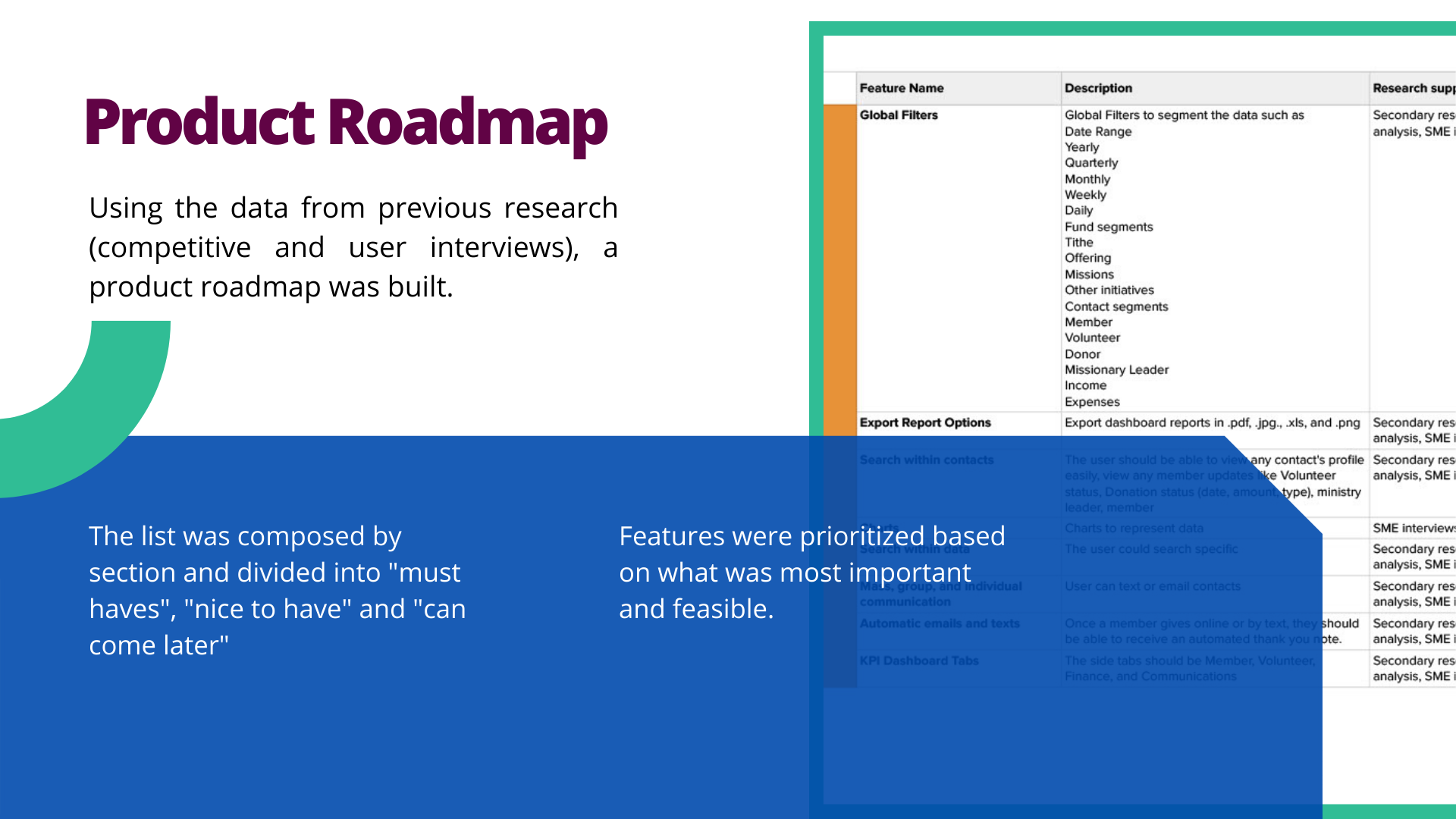
We were tasked to create a responsive dashboard that would enable admin to export reports and maintain communications with the congregation easily.
-
My Role:
UX/UI Designer
-
Timeframe
4 weeks
-
Tools
Figma, Miro, Zoom, and Google Suites

Empathize
Objectives
Gather data and understand the current market for church analytics dashboards
Assess competitor strengths and weaknesses
Methodology
Secondary Research
Competitive Research
Empathy Research
User Interviews

Secondary Research
We found out that:
Analytics dashboards for giving are prevalent for churches and non-profits
Most platforms allow for automatic emails to donors direct from the church or non-profit’s websites
All had different ways to filter their website data

Competitive Research
We found out that:
5 out of 5 churches and nonprofits utilized an analytics platform to track donations
3 out of 3 churches received overings via website, text, and in person
2 out of 5 did not have an automatic Thank You email or text for donations
User Interviews
Subject Matter Expert Interviews
Ages: 33 - 68
Occupations: Pastor, Church Administrator, and Donation and Fundraiser Manger.
Methodology
Secondary Research
Competitive Research
Empathy Research
User Interviews
Findings
All participants’ churches and nonprofits received donations or offerings by website, text, and in person
100% of participants mentioned that offerings/donations utilized two different mediums to track their income, Quickbooks and the analytics platform of their choice (Excel, Pushpay, or Blackbaud)
100% of participants tracked volunteers using multiple mediums that is not the same as their analytics platform.
100% of participant mentioned that platforms that are made to make analytics much easier are often difficult to navigate and use because categorizations and search are not intuitive.
What does all the research mean?
The learning curve to use these platforms is high
People often have rosier memories of the learning curve when utilizing a new platform because they now know all the “quirks” and intricacies
Older demographics are not as tech-savvy and likely not adopt new tech for better tracking and processes
Older organizations have set processes that they’re comfortable with regardless of how manual and tedious it is. If it ain’t broke, why fix it?
On some platforms you have to manually import contacts one by one
Duplicate contacts is an issue for some platforms.

Define


Defining the Problem
How can we help churches maximize the use of their donor and volunteer data in an intuitive way so that they can easily make financial decisions, as well as maintain positive relations with their contacts?
Possible Solutions
Ensure precise data entry
Faster and easier contact financial data entry processes
Intuitive categorization and easy search for easy navigation
Direct communications with members, donors, and volunteers
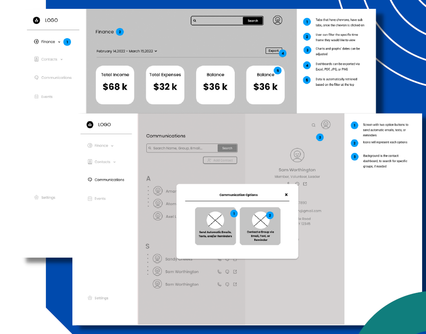
Provide quick context for each contact
Easy to understand and create financial overviews and reports
Ideate

User Flows
Designing the user flow gave more insight into the decision making process, frustrations, and successes of the user.
The user journey allowed us to see the different paths a user might take in viewing Total Gifts and sending an automatic reply.
What we decided to design
After much brainstorming, we decided to design a church analytics dashboard that would help admin export reports quickly and communicate with the congregation automatically like send an automatic thank you email any time a member donates to the church.

Design
Low-Fidelity Wireframing
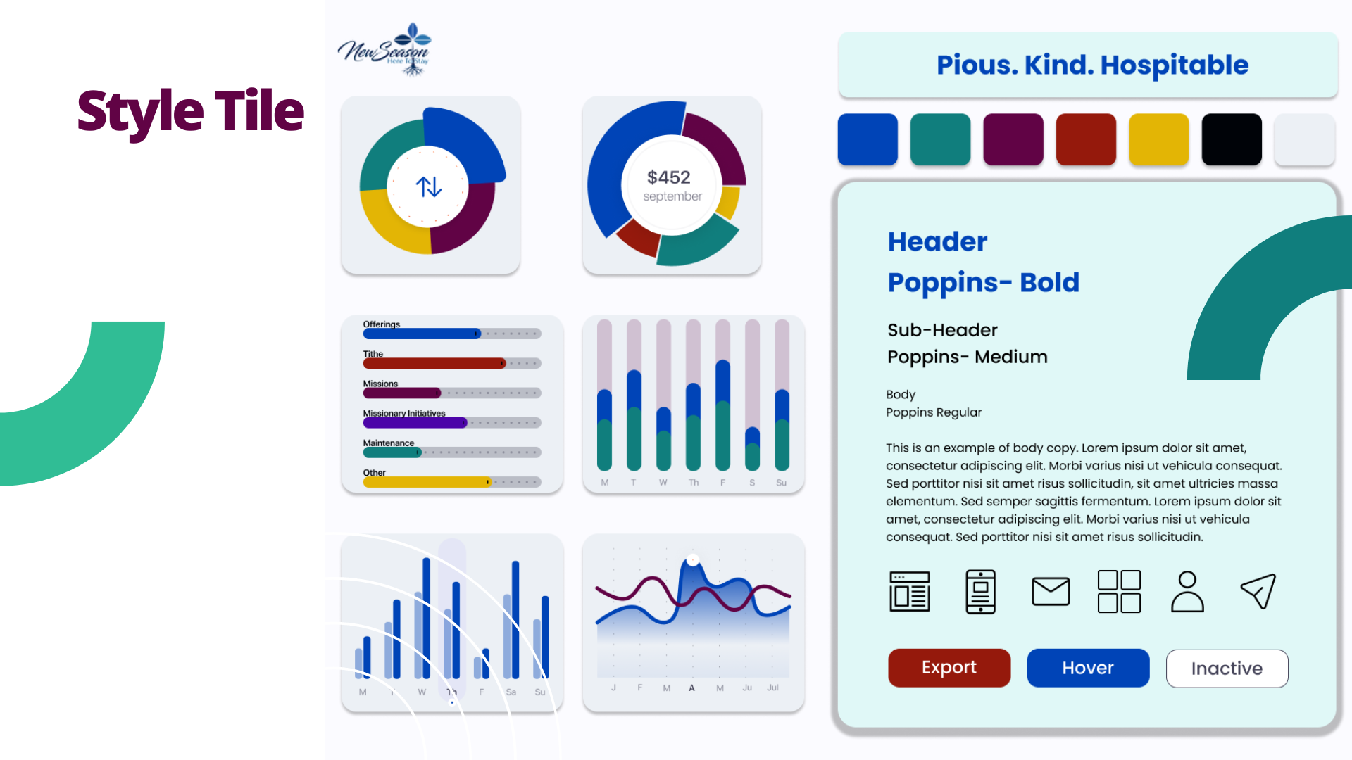
I utilized Figma for rapid visualization of the Church Analytics dashboard layout with annotations.
The initial versions were critical for feedback from my mentor and peers. The first version helped shape the design decsions for the dashboards.

Creating the Prototype
A few things learned by prototyping are:
Breaking down how an automatic reply flow into steps would make creating them easier to complete
The "Next" button should be in the same position on different screens for continuity
Usability Tests
Ages: 22-48
Occupations: VP of Marketing, Anesthesiologist, Shift Lead Project Manager, Beauty Consultant, and Electrician
Previous Experience with Analytics: 80% of participants
Tech Savviness: All claim to be pretty tech savvy
Objectives
Test the ease of:
Finding Total Donations/ Gifts and downloading report
Sending an auto-reply from a landing page
Identify any pain points or confusion while using the dashboards
Tasks
Find the Total Gifts for this week
Download the report
Email the report to yourself
Create an automatic Thank You Note email for donations from the website
Findings
All participants were able to successfully find the Total Gifts from the past week and email it to themselves
All participants used the “Gifts” filter to find “Total Gifts”
100% wanted to select Email as the Automatic reply starting point instead of Landing Page
60% did not read the prompts that came along with each step
20% wanted to see how the email was retrieved
20% thought the example texts could be better to guide the user for the tasks

What does it all mean?
The filters and the buttons for the Finance dashboard are intuitive. Participants with varying experience with Analytics were able to successfully complete the first two tasks.
Recommendation: Keep Finance Dashboards as is
Most participants are likely to skim the text and click around in order to learn how to complete the task.
Recommendation: Simplify the steps to only what is necessary, allow for user errors to be easily
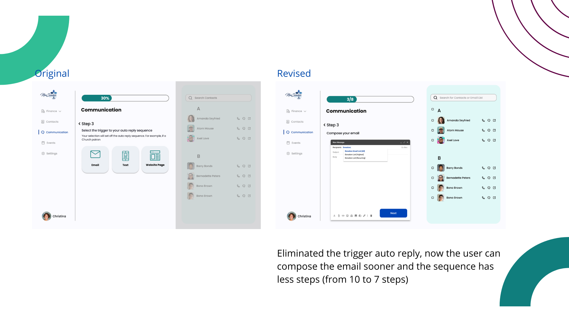
All participants struggled with identifying the starting point of the Automatic Reply flow, they were compelled to compose the email first
Recommendation: The system should already know where the automatic reply should respond to based on the email list. Remove the responsibility from the user and focus them on creating the email and the timeframe the autoreply should be on
Test & Iterate
Overview of Revisions
-
In order to avoid confusion, I matched the sample text to what the user will likely search.
-
Starting the communications flow with drafting the email or text first, would help avoid confusion, since the user is thinking about creating the content of the email or text first.
-
By showing where the email list is retrieved on the right-hand side of the dashboard or in the email’s “To” field, the user will be able to easily search for their desired contact list easily.
-
Eliminated the trigger auto-reply, now the user can compose the email sooner and the sequence has less steps (from 10 to 7 steps)


Next Steps & Reflections
Designing Additional Screens
With more time, I would have loved to design and the create a contact and contact import screens. I wanted to add a mass import and camera functionality, so that church admins can easily add people to their contact list from the offering envelopes
The Design Process
enjoyed researching, designing, and iterating the Church Analytics dashboards in order to make reporting and supporting ongoing relationships for the Church easier..