

Crunchyroll: Adding a Feature
Designing a new feature to add to the premiere Anime streaming iOS app
Background
Crunchyroll is America's largest streaming service for anime that also provides access to manga, events, and merchandise.
The Objective
We were tasked to design a new feature for an existing mobile application.
-
My Role:
UX/UI Designer
-
Timeframe:
4 weeks
-
Tools:
Figma, Miro, Zoom, Calendly, and Google Suites

Empathize
Objectives
Determine the primary devices that most users watch their anime on
Identify major frustrations with their experience when watching anime on the app
Methodology
Secondary Research
Competitor Research
User Interviews
Empathy map
Secondary and Competitor Research Findings
Most streaming services are following Netflix's lead by providing a skip intro and outro
Most streaming services offer three different subscription plans

User Interview Research
Ages: 28-33
Genders: 50% Female and 50% Male
Occupations: Blue collar and white collar careers

What we now know.
Most users trust their friends' anime recommendations over the app's
Most users will share their basic paid account with at least one other person
Users are willing to pay for a streaming subscription to avoid ads
Most users will access Crunchyroll through iOS
Define

Defining the Problem
Given the vast anime landscape in which most anime is mediocre, how can we provide meaningful show recommendations, so that users can continue to be engaged with the streaming service?
Possible Solutions
Friend Recommendations
Send kudos to friends
Achievement system to increase engagement and encourage singular profiles
Influencer Recommendations like IGN, Buzzfeed, People Like You

Ideate
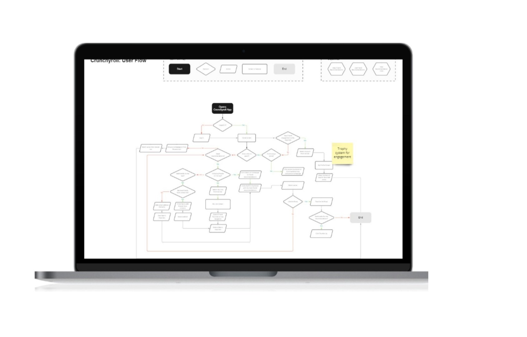
User Flow
Designing the user flow gave more insight into the decision-making process, frustrations, and successes of the user.
The user journey allowed us to see the different paths a user might take in viewing Friend Recommendations, Adding a New Friend, Giving Kudos
What we decided to design
Friend Recommendations
Send kudos to friend
Achievement system to increase engagement and encourage singular profiles
We decided to design multiple features because time permitted it and we decided to have fun with it. These features were based on what we thought would add the most value to the Crunchyroll iOS app.

Design

Low- Fidelity Wireframing
I utilized Figma for rapid visualization of Crunchyroll's layout.
I wanted to emphasize how user's can find friend recommendations, how they can encourage one another to continue to curate recos, and how the app can encourage user engagement and solo paid subscriptions


Creating the Prototype
A few things learned by prototyping are:
Too many connections make for a confusing user flow
It's important to find multiple ways to access a certain screen
Test & Iterate
Usability Tests
Ages: 28-33
Genders: 25% Female and 75% Male
Occupations: Varying blue collar and white collar careers
Streaming Usage: 1x/ week - Everyday
Phone OS: iOS
Objectives
Analyze and test the intuitiveness of :
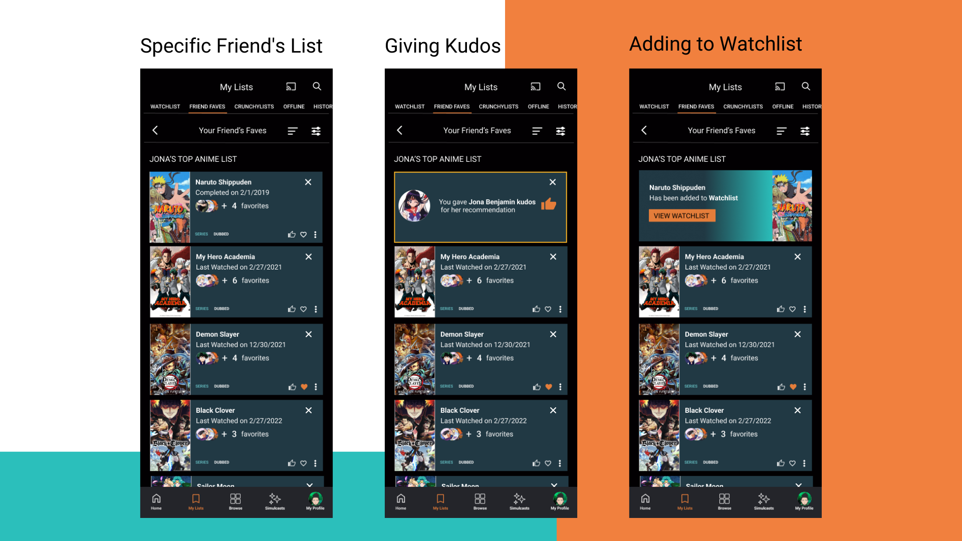
Viewing a friend’s recommendation list
Adding new friends
Giving kudos to a friend’s suggestion
Adding recommendations to watchlist
Viewing earned trophies
Identify any pain points or confusion while using the app
Findings
All participants were able to locate Friend Faves easily on the homepage
All participants were intrigued by the Achievement System
All participants easily gave kudos to their friend
All participants added a show from their friend's list to their own list
All participants were inclined to click the three dot expanded button
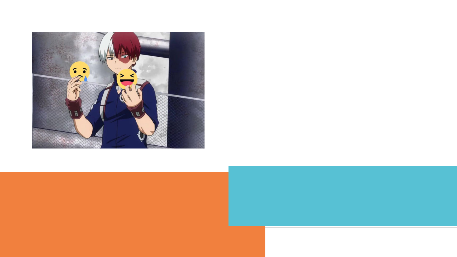
25% of participants struggled to add friends altogether
25% thought the icon "X" did not represent unfollow friend accurately
What does that tell us?
Viewing friend's recommendations, as well as viewing friends, was intuitive
Users were confused about the meaning behind the icons since they're pretty similar
Users were intrigued with the trophy system

Overview of Revisions
-
Despite Crunchyroll defining the heart icon as “Add to Watchlist”, the new features made it confusing for users to differentiate “Add to Watchlist” and “Recommend this Show”. Changing the icon from a heart to a bookmark helped alleviate the confusion between the two actions.
-
I redefined the heart icon from “Add to Watchlist” to “Recommend this Show”. Most users associate a heart icon with favoriting something. This redefinition is much more intuitive for users because of it’s usual associations to “like” or “favorite” in other popular apps.
-
I’ve designed additional screens to indicate what happens after tapping each icon to clarify what each icon’s action is.
-
Since all participants were inclined to tap the three dot expand menu icon, I decided to add a screen that would indicate the other menu items.
-
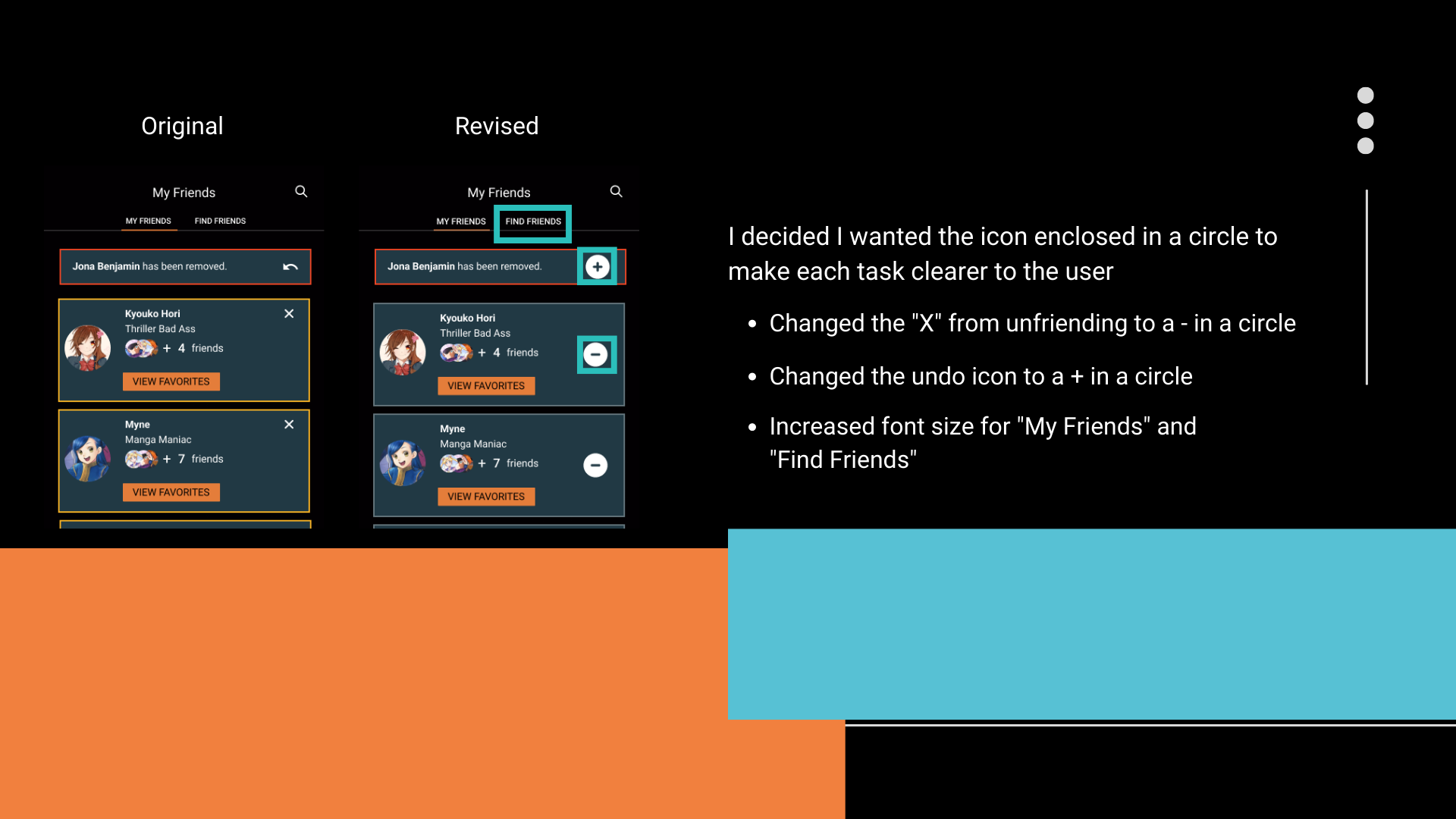
Since a few participants thought the “X” meant exit the screen, I changed it to “-” in a circle to indicate that touching this icon would deduct this person from your friend list.
-
Despite each participant understanding that the redo button meant re-adding a friend. Like the minus button for unfriending, to keep in line with the same logic, I changed the redo icon to a “+” to add a new friend.
-
To help with visibility, I’ve increased the font size of “Find Friends”.

Next Steps & Reflections
Fleshing Out the Reward System
With more time, I would have loved to design the Trophy System in its entirety. It garnered the most excitement from the usability test participants. The thought process here was to keep users motivated to recommend great anime to friends and encourage users to open up their own Crunchyroll account, since most users share their paid accounts with at least one other person.
The Design Process
The best part of the design process was isolating a need for Crunchyroll app users during the Empathy phase. As an anime fan myself, it was intriguing to see how many people experienced similar frustrations. Most people struggled to find new shows that they would like and would often trust their friends' recommendations because they've already vetted a series.
Ideating a way to solve that problem whilst continuing user engagement, was incredibly fun. It was even more satisfying to see app power users' excitement about the new features to add a friend and view their recommendations while receiving trophies for it.