

Pet Pals
Designing a new app that matches people to their adoptive fur baby
Background
Pet Pals is a non-profit dedicated to helping animals find their perfect homes. Their mission is to save lives today while co-creating a future where our definition of "community" includes all living things.
The Objective
We were tasked to design an MVP of a mobile app from scratch.
-
My Role:
UX/UI Designer
-
Timeframe:
4 weeks
-
Tools:
Figma, Miro, Zoom, Calendly, and Google Suites

Empathize
Objectives
We wanted to learn users' main pain points when adopting an animal to brainstorm potential solutions via mobile app.
Two key things we wanted to discover:
Identify target user
Determine major frustrations when adopting an animal
Methodology
Secondary Research
Competitor Research
User Interviews

Secondary and Competitive Research Findings
There has been a marked increase in interest and ownership of pets, especially as a result of the pandemic where most people were stuck at home and were looking for companionship.
Many animals that were in shelters were likely to have found homes in 2020 and 2021.
User Interview Research
Ages: 32 - 55
Genders: 75% Female and 25% Male
Children: 100% had no kids
Occupations: 75% had professional high paying jobs


What we now know.
People are more reliant on social media to research and adopt their prospective pet because the information is updated more regularly
People are willing to drive long distances for the companion of their dreams
Most people are not satisfied with the level of detailed information on the background of their pet
No one feels prepared for the reality of adopting a pet
Most people felt that the communication with the shelter/ rescue could have been better
Define
Building the Persona
Based on the results of the user research interview, I built a persona to help define who we were building the application for. I wanted to ensure that through every step of the design process, we were keeping Jasmine’s goals, needs, pains, and frustrations at the forefront of our minds.


Defining the Problem
How can we help people who want to adopt an animal feel prepared, in order to minimize the likelihood of returning the animal back to the rescue, shelter, or sanctuary?
Possible Solutions
Lifestyle Quiz- Match certain people to specific animals- eHarmony for rescues
Training Hub- An app to show all types of animal behaviors, along with videos and step by step guides for how-tos
A WebMD for Dogs and Cats- Common and not so common ailments and remedies, know when to to go to a vet

What we decided to design
A lifestyle quiz that would match people interested in adopting a dog that would better prepare them for adoption.
Ideate

User Flow
Designing the user flow gave more insight into the decision-making process, frustrations, and successes of the user.
The user journey allowed us to see the different paths a user might from matching with a dog to adopting their favorite dog.

Design

Low-Fidelity Wireframing
I used Figma for rapid visualization of Pet Pals’ basic lay out to understand how the user would travel from one screen to another


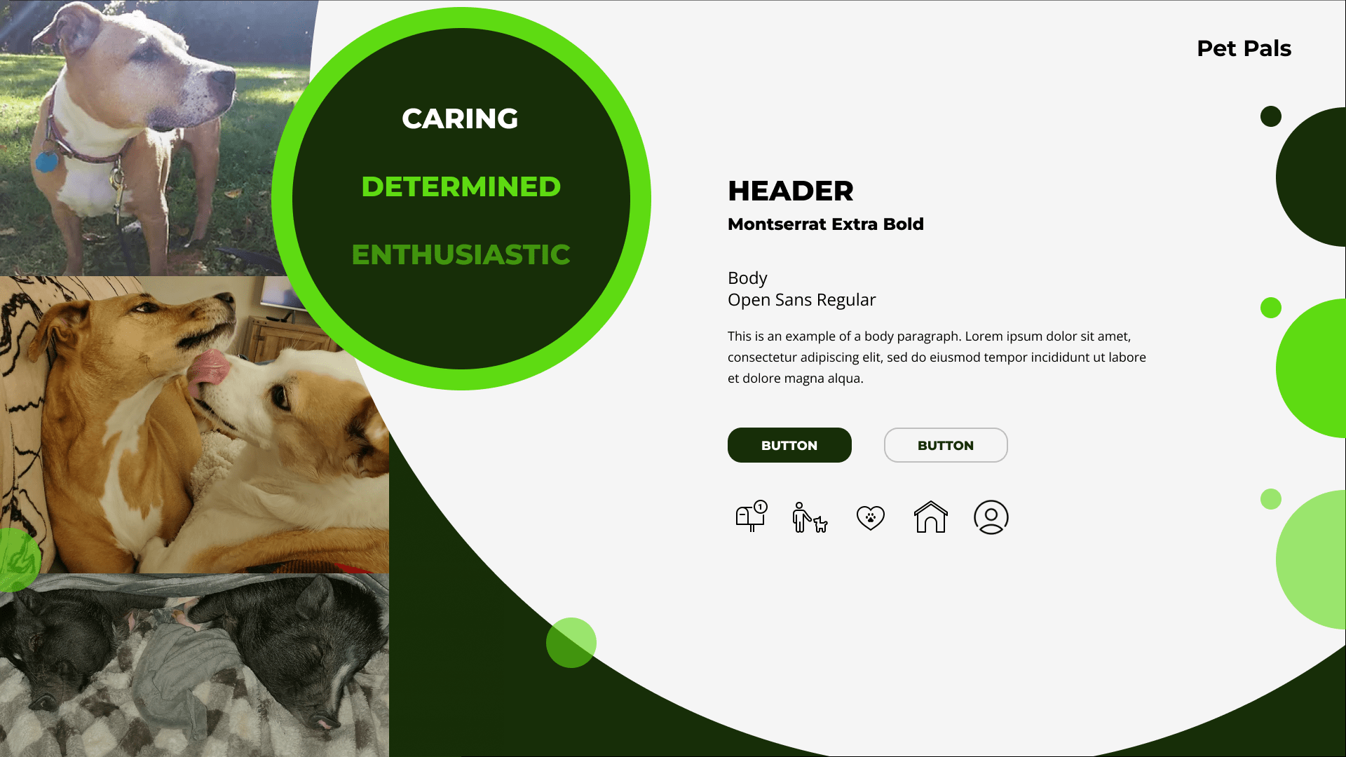
Creating the Style Tile
Pet Pals is dedicated to placing their animals into the right homes. As such, it was important that the brand convey that adding an animal to your family is not just great for the community, but is ultimately natural. That is the main reason why we stuck to a green palette, to emphasize nature, stability, and prosperity. Additionally, the use of circles is a symbol of unity because only when we come together can we make our communities a better place for us all.


Constructing the Prototype
A few things I learned from prototyping the app are:
In my first prototype, I did not necessarily need all the questions necessary to match a dog. All I needed was to see how the quiz would flow into the match results.
Sometimes it’s better to have clear labels than to have a minimalist design, to make it easier for the user to learn each icon within the navigation.
Test & Iterate
Usability Tests
Ages: 32-55
Genders: 50% Female and 50% Male
Children: 75% had no children, 25% had adult children
Occupations: 75% had professional high paying jobs
Objectives
Analyze and test the intuitiveness of:
Taking the quiz and results
The process of pet matching
Contacting the adoption house
Completing the common app form
Checking for approval
Setting up pick up
Helpfulness of the app and quiz
Findings
All participants were able to complete all tasks
All participants found the app useful and would use it when they're ready to adopt
All participants struggled with enlarging the dog's photo. They thought the drag down was unintuitive
All participants thought tapping would increase photo size
75% had issues with the favorites page
25% wanted the CTAs to be higher for easier access
25% did not know how to access this page
25% had "swipe" fatigue and simply wanted to view options
75% had different confirmation expectations
50% wanted a confirmation email after submitting the Common Application
25% wanted the adoption fees disclosed
25% expected the email screens to be full screen
50% wanted more information regarding the dog's breeds

What does that tell us?
People find the existence of this app helpful.
The gestures to enlarge a photo was not intuitive.
The Favorites screen is too similar to the match screen.
Dog breeds matter to some people.
Overview of Revisions
-
Since all participants thought to double-tap a photo to enlarge instead of swiping the photo down, I changed the gesture to what they had expected to avoid confusion.
-
For users who have used many dating apps and feel swipe fatigue because they feel pressured to make a snap decision on whether they want to date someone, I’ve added a heart icon to represent “favorite” the dog. This way they can peruse the other matches without the penalty of not being able to view past favorites.
-
I also changed the swipe right gesture to mean “view more matches” to allow the user to see all the other dogs they matched with without committing to a specific one.
-
Placing the “Contact” and “Adopt” CTAs higher on each dog’s profile, will allow the user to differentiate the dog’s regular profile and the favorited page, as well as make each action more accessible to the user.
-
Adding a confirmation email after submitting the common application should help the potential feel comfortable knowing that their application has been sent to the right people and that they will receive further communication once it is approved.
Why we did not include breeds
Adoption houses usually have mixed breeds or do not know the dog's breed.
The goal of the app is to match by dog personality to an adoptive family regardless of breed. We're trying to match the right dog to the right home, so that all parties can be happy.


Next Steps & Reflection
Next Steps and Reflection
With more time, I would like to create a home preparation checklist and ideate a new screen for people looking to adopt more than one dog. The home preparation checklist is ideal for new dog parents to dog-proof their homes, as well as purchase the necessary items their dog would need.
I truly enjoyed designing my first application MVP for Pet Pals. Finding and defining the problem after much research was truly satisfying because I was really starting from scratch without any clue, as to what I was going to eventually build.